Add setting to skip desktop nofifications #1834
No reviewers
Labels
No labels
accessibility
app-parity
area: creator
area: daemon
area: design
area: devops
area: discovery
area: docs
area: installer
area: internal
area: livestream
area: performance
area: proposal
area: reposts
area: rewards
area: search
area: security
area: subscriptions
area: sync
area: ux
area: viewer
area: wallet
BEAMER
channel
comments
community PR
consider soon
core team
css
dependencies
electron
Epic
feature request
first-timers-only
good first issue
hacktoberfest
help wanted
hub-dependent
icebox
Invalid
level: 0
level: 1
level: 2
level: 3
level: 4
merge when green
needs: exploration
needs: grooming
needs: priority
needs: repro
needs: tech design
notifications
odysee
on hold
playlists
priority: blocker
priority: high
priority: low
priority: medium
protocol dependent
recsys
redesign
regression
resilience
sdk dependent
Tom's Wishlist
trending
type: bug
type: discussion
type: improvement
type: new feature
type: refactor
type: task
type: testing
unplanned
windows
No milestone
No project
No assignees
1 participant
Notifications
Due date
No due date set.
Dependencies
No dependencies set.
Reference: LBRYCommunity/lbry-desktop#1834
Loading…
Add table
Reference in a new issue
No description provided.
Delete branch "issue-1788"
Deleting a branch is permanent. Although the deleted branch may continue to exist for a short time before it actually gets removed, it CANNOT be undone in most cases. Continue?
Closes issue #1788
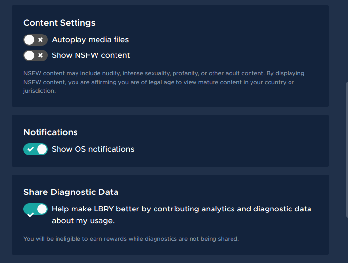
It persist the setting on localstorage, defaults to true(notifications enabled), I've created a selector to check if the notification should be run.
Example:
if(selectDesktopNotificationsEnabled(state)) thenNotify()The setting is present here, let me know If I should change the text/section of the checkbox.

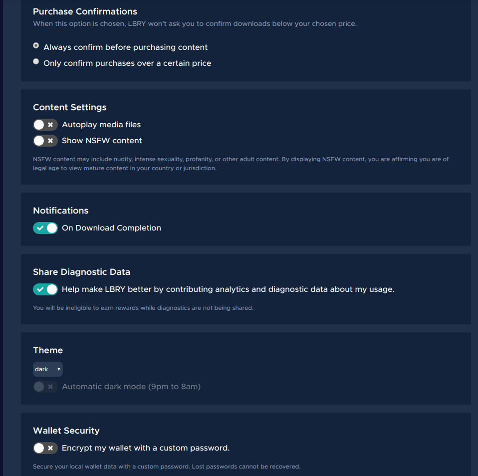
This should not be clustered until the Download Directory. I'd suggest making a new section with a header of "Notifications". The label for the checkbox can be "Notify me when a download completes" or just "On Download Completion", whichever looks better.
@seanyesmunt is the checkbox used on the file show page intended to be the new checkbox used everywhere? If so, it should be used here (and really, replace all checkboxes). Mixed styles for the same element are a big design inconsistency.
@kauffj on point 1, I've made the code to enable/disable all kind of desktop notifications, not just when it finishes downloading, should I add code to cover only this case: "Notify me when a download completes" ?
If so I should change the property to be something like this:
finishedDownloadNotificationEnabledrather than the globaldesktopNotificationsEnabledUpdated checkbox to toggle style on settings page.

Yes the plan is to add that to all checkboxes. @dan1d I would check to make sure the description is still lined up properly on smaller screens when the description text has to wrap to the next line.
The notifications include more than just download complete - we also do notifications for subscriptions when new content is posted. And we'll probably add more (think there's an issue for adding a published complete notification).
IMO, it should be called something along the lines of OS/System Notifications so as not to be confused with the in-app notification system (when it's added).
Yeah I think for the first step we will just add a blanket mute for all notifications. I like @tzarebczan's idea of calling them
OS NotificationsMaybe the description should be
Hide OS notificationsI've changed the variable names to
osNotificationsEnabledand the selector toselectOsNotificationEnabled.@seanyesmunt I've changed the word from
Hide OS nofiticationstoShow OS notificationsto keep it in sync withShow NSFW contentcheckbox. Is that ok?The check sign has a weird behavior on smaller screen.

@dan1d looks great! Can you label it "Show Desktop Notifications"?
Nice. You may need to make some change to
_toggle.scss. Not sure what would be causing that.Thanks @seanyesmunt,

I've Added
margin-top: auto; margin-bottom: auto;to.react-toggleclass and it adjust automatically to the center of the parent box. Which fix the issue. Let me know if I should change that part.Or do you prefer the toggle to stay at the top? regardless of the parent size ?
I think that fix is fine (or a similar one), but in my opinion the toggle should be at the top. In-line with the first line of the description.
Done!

@dan1d Just tested this and it looks great! One thing I forgot to say is that we should probably just get rid of the
useToggleprop and always use this toggle. That was only when we only used the toggle in one place. Once that is done and a changelog entry is added this can be merged.Nice work! 🙂
@seanyesmunt Thanks for the review. Removed the useToggle prop and added the changelog entry.