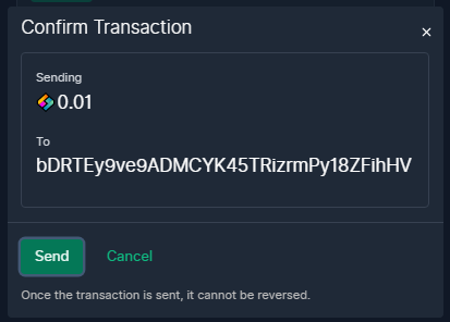
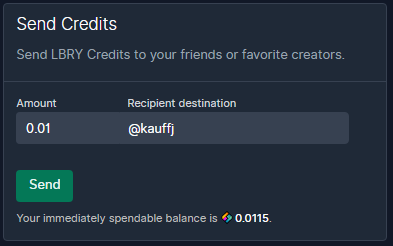
allow sending directly to a channel or content address #5990
No reviewers
Labels
No labels
accessibility
app-parity
area: creator
area: daemon
area: design
area: devops
area: discovery
area: docs
area: installer
area: internal
area: livestream
area: performance
area: proposal
area: reposts
area: rewards
area: search
area: security
area: subscriptions
area: sync
area: ux
area: viewer
area: wallet
BEAMER
channel
comments
community PR
consider soon
core team
css
dependencies
electron
Epic
feature request
first-timers-only
good first issue
hacktoberfest
help wanted
hub-dependent
icebox
Invalid
level: 0
level: 1
level: 2
level: 3
level: 4
merge when green
needs: exploration
needs: grooming
needs: priority
needs: repro
needs: tech design
notifications
odysee
on hold
playlists
priority: blocker
priority: high
priority: low
priority: medium
protocol dependent
recsys
redesign
regression
resilience
sdk dependent
Tom's Wishlist
trending
type: bug
type: discussion
type: improvement
type: new feature
type: refactor
type: task
type: testing
unplanned
windows
No milestone
No project
No assignees
1 participant
Notifications
Due date
No due date set.
Dependencies
No dependencies set.
Reference
LBRYCommunity/lbry-desktop!5990
Loading…
Add table
Add a link
Reference in a new issue
No description provided.
Delete branch "master2"
Deleting a branch is permanent. Although the deleted branch may continue to exist for a short time before it actually gets removed, it CANNOT be undone in most cases. Continue?
PR Checklist
Please check all that apply to this PR using "x":
PR Type
What kind of change does this PR introduce?
Fixes
Issue Number: #5985
What is the current behavior?
Just wallet address:

What is the new behavior?
Wallet address + channel or content handle:

Great feature!
Check out the tip modal and maybe use two tabs: [ address ] [ lbry:// ] for the different modes,
Then it would be good to show a preview of the selected if you're in url mode as shown here:
https://odysee.com/$/repost?to=jsojsjjjjjj
Check out how this was done in https://github.com/lbryio/lbry-desktop/blob/master/ui/page/repost/view.jsx
If you're feeling awesome, make pull down autocomplete suggestions :)
@jessopb thanks for the feedback! something like this?
Great job - I think it looks a bit better with ClaimPreview type="small" in this case - it hides the tags and such. Will take a look at actual code today.
yeah it does look better
Nice.
no error info is being shown during entryThis isn't your fault, I think.-- maybe put a search field on top, the preview in the middle, and the amount and actual recipient url at the bottom?
Check it out now:
Also how about this "from" section on confirmation?
I think I would use claim preview type small in the confirm too.
And the placeholder text is wrong.
Anything else you think has bad visual hierarchy or spacing, but looks pretty good.
@jessopb What about this?
I didn't understand this part
Thanks, I gave it a try.
I think if I type one thing, and an amount, and it shows me the preview I want, it should be ready to send.
It should probably just be
Amount:
Recipient Search:
Then if there's a claim there, it fills the url in the background and enables send.
@jessopb How about this?
Nothing:
Not found:
Found:
(Also on the last commit I found out the code currently isn't filtering for amounts greater than the current balance, it allows you to send and only give an error after the attempt)
@ -10,0 +99,4 @@setContentUri(searchContent);} else if (isChannel && channelName && isNameValid(channelName)) {// contentNameValid = true;setContentUri(searchContent);are you sure these two can be removed?
@ -10,0 +99,4 @@setContentUri(searchContent);} else if (isChannel && channelName && isNameValid(channelName)) {// contentNameValid = true;setContentUri(searchContent);thanks, it was an accident